MSP Website Examples 2025 (MSP Website Inspiration)
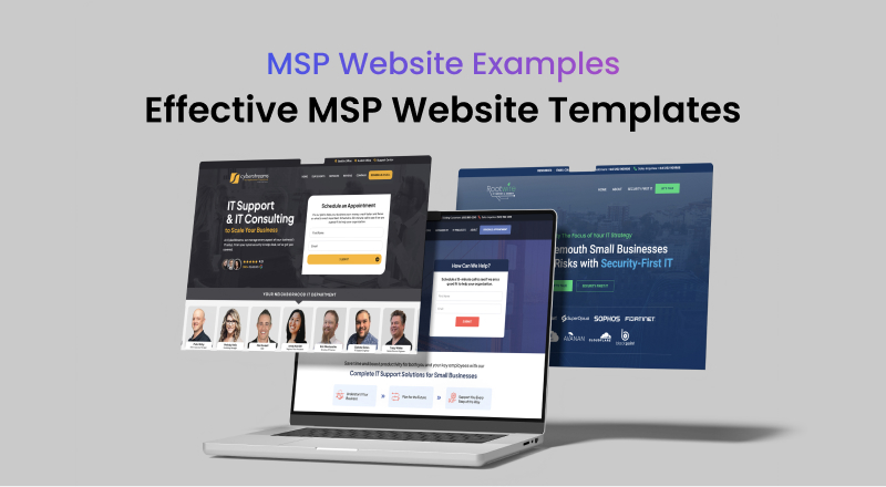
MSPs must have a website that goes beyond the basics. An effective MSP website should not only list services but also showcase the company's unique approach, values, and expertise. Here, we explore eight MSP websites that excel in engaging visitors and making a lasting impression, each with a standout feature that sets them apart.
1. CyberStreams
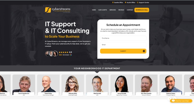
CyberStreams embraces a community-centric approach, presenting itself as a friendly, neighborhood IT department. The website strikes a perfect balance between professionalism and personal touch. By emphasizing their local presence and commitment to their community, they create a welcoming atmosphere for potential clients.
Standout Feature: Carousel of Staff Members
The "Your Neighborhood IT Department" carousel features real photos of team members, highlighting the company's personal and approachable nature. This feature showcases the real people behind the business, fostering trust and making it easier for visitors to feel connected to the company. Unlike stock images, this genuine display reassures potential clients that they'll be working with a team that is both relatable and reliable.
2. Tech Paces
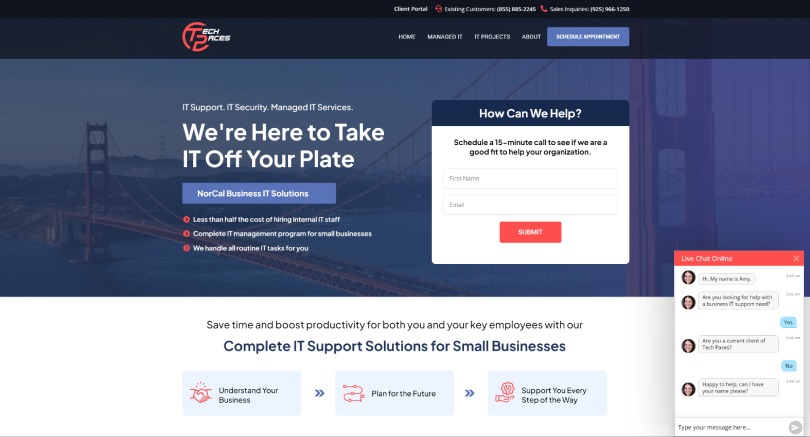
Tech Paces understands the importance of immediate interaction in building client relationships. Their website is designed to engage visitors from the moment they arrive, offering a clean and modern interface that emphasizes customer support and accessibility.
Standout Feature: Live Chat for Immediate Connection
The live chat feature is prominently displayed on the homepage, signaling that Tech Paces is ready and eager to assist. This tool provides potential clients with an immediate avenue for communication, whether they have questions about services or need more information. By being readily available, Tech Paces demonstrates its commitment to customer service, setting the stage for a proactive and client-focused relationship.
3. IT Houston 360

IT Houston 360 positions itself as a no-nonsense IT provider, clearly articulating its unique selling proposition on its website. The site takes a bold approach in defining what sets them apart, providing clarity and confidence for visitors who are exploring different MSP options.
Standout Feature: Clear Differentiation with "No-Nonsense IT"
The "What is (and isn’t) ‘no-nonsense’ IT" section is a masterclass in differentiating from the competition. By using an easily digestible compare-and-contrast list, IT Houston 360 effectively communicates what makes their services distinct. This direct and honest approach helps potential clients quickly grasp the company's philosophy and the benefits of choosing a straightforward, reliable IT partner.
4. Rootwire
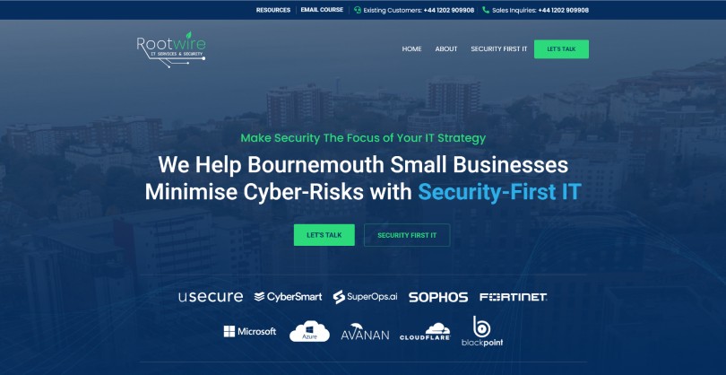
Rootwire’s website embodies a security-first mindset, emphasizing their focus on protecting businesses. They have successfully positioned themselves as a security-centric MSP, appealing to clients who prioritize safeguarding their data and operations.
Standout Feature: Security-First Messaging
Rootwire’s security-first theme resonates throughout the website, sending a clear message that they take cybersecurity seriously. This focus assures visitors that Rootwire understands the importance of security in today’s digital landscape. By emphasizing this aspect of their services, they differentiate themselves from more generalized IT providers and appeal directly to businesses for whom security is a top concern.
5. Secunis
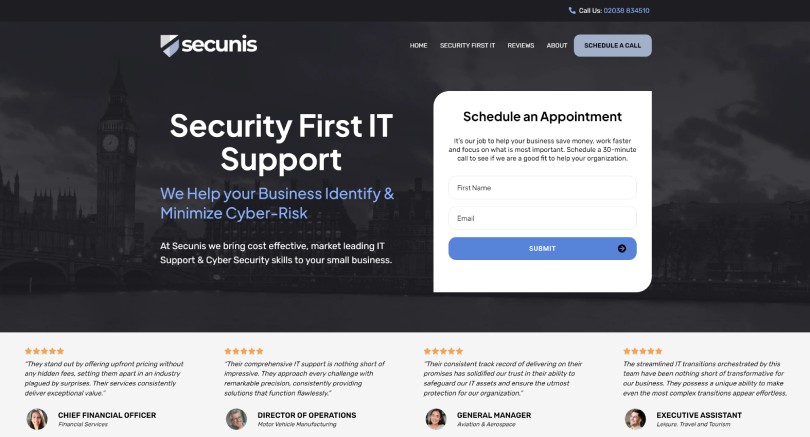
Secunis has crafted a website that is both sleek and informative, offering a seamless browsing experience. They understand the power of social proof in building trust and use it effectively to showcase their reliability and success.
Standout Feature: Prominent Testimonials for Instant Trust
Secunis features client testimonials prominently, just below the hero section. This placement allows visitors to quickly see the positive impact the company has had on its clients. Instead of relying solely on marketing language, they let their clients' experiences speak for their quality and reliability, creating an immediate sense of trust and credibility.
6. Inman Technologies
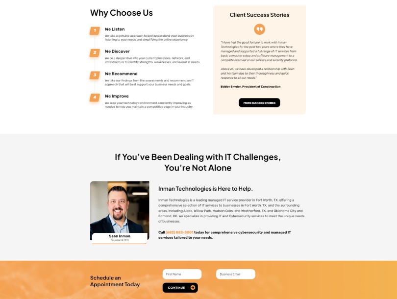
Inman Technologies simplifies the visitor's journey by placing all essential information on the homepage. Their approach caters to a wide range of potential clients, providing everything needed to make an informed decision without the need for extensive navigation.
Standout Feature: Comprehensive Information on the Homepage
All the critical details—contact info, service descriptions, testimonials, FAQs—are neatly organized on the homepage. This reduces friction for visitors who want to understand the company quickly. By offering a one-stop experience, Inman Technologies ensures that potential clients can find what they need without jumping through hoops, which can be a game-changer in maintaining visitor interest.
7. Delta Tech
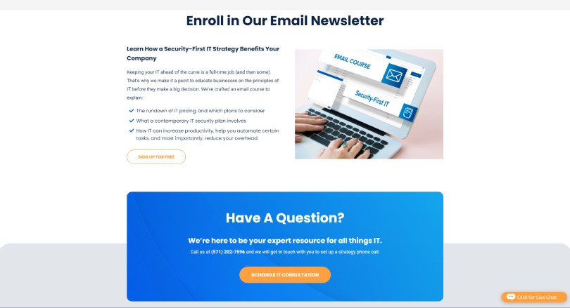
Delta Tech recognizes that not every visitor is ready to commit immediately. Their website is designed to maintain engagement over time, offering a pathway for potential clients to stay connected and informed through ongoing communication.
Standout Feature: Email Newsletter Sign-Up for Ongoing Engagement
The email newsletter sign-up is strategically placed on the homepage, inviting visitors to subscribe and stay updated. This approach allows Delta Tech to keep in touch with potential clients who may not be ready to switch MSPs right away. By providing valuable content through newsletters, they stay top-of-mind, nurturing relationships until the right moment for engagement arises.
8. Big Water Tech
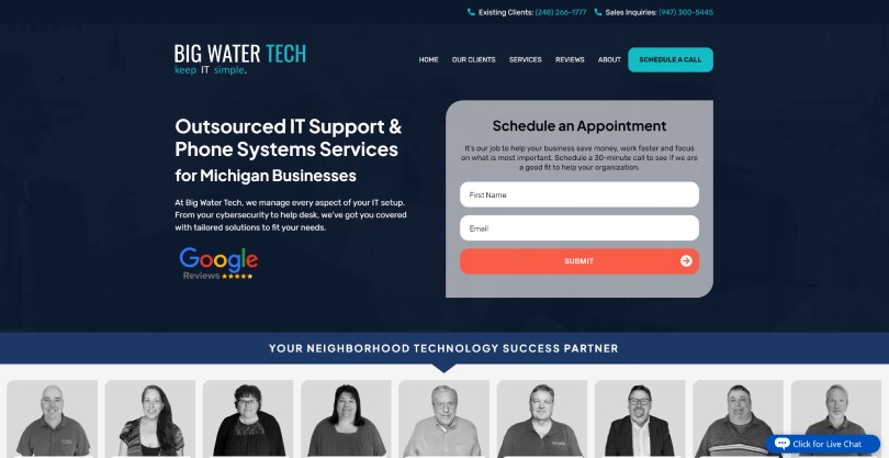
Big Water Tech’s website is user-centric, designed to streamline the experience for both potential and existing clients. They pay close attention to the nuances of client interactions, making it easier for visitors to get the assistance they need promptly.
Standout Feature: Clear Separation of Contact Numbers for Sales and Support
By clearly listing separate phone numbers for sales inquiries and existing customer support at the top of the page, Big Water Tech eliminates confusion and frustration. Potential clients aren’t lost in support queues, and current customers receive the direct assistance they need. This thoughtful MSP website design choice demonstrates an understanding of different client needs and reinforces the company's commitment to providing efficient and effective service.
Creating a Memorable Online Presence
These MSP websites excel because they do more than present services—they tell a compelling story, build trust, and engage visitors with clarity and purpose. From showcasing real team members to offering immediate communication and highlighting unique value propositions, each site embodies a strategic approach to connecting with potential clients. By focusing on what matters most to their audience, these MSPs have created digital presences that not only attract visitors but also convert them into loyal clients.
If you're inspired by these exceptional examples and are looking to create a compelling online presence that truly reflects your MSP’s unique strengths and values, discover how you can transform your website here at MSPsites.com.

MSP Website Examples 2025 (MSP Website Inspiration)
MSPs must have a website that goes beyond the basics. An effective MSP website should not only list services but also showcase the company's unique approach, values, and expertise. Here, we explore eight MSP websites that excel in engaging visitors and making a lasting impression, each with a standout feature that sets them apart.
1. CyberStreams

CyberStreams embraces a community-centric approach, presenting itself as a friendly, neighborhood IT department. The website strikes a perfect balance between professionalism and personal touch. By emphasizing their local presence and commitment to their community, they create a welcoming atmosphere for potential clients.
Standout Feature: Carousel of Staff Members
The "Your Neighborhood IT Department" carousel features real photos of team members, highlighting the company's personal and approachable nature. This feature showcases the real people behind the business, fostering trust and making it easier for visitors to feel connected to the company. Unlike stock images, this genuine display reassures potential clients that they'll be working with a team that is both relatable and reliable.
2. Tech Paces

Tech Paces understands the importance of immediate interaction in building client relationships. Their website is designed to engage visitors from the moment they arrive, offering a clean and modern interface that emphasizes customer support and accessibility.
Standout Feature: Live Chat for Immediate Connection
The live chat feature is prominently displayed on the homepage, signaling that Tech Paces is ready and eager to assist. This tool provides potential clients with an immediate avenue for communication, whether they have questions about services or need more information. By being readily available, Tech Paces demonstrates its commitment to customer service, setting the stage for a proactive and client-focused relationship.
3. IT Houston 360

IT Houston 360 positions itself as a no-nonsense IT provider, clearly articulating its unique selling proposition on its website. The site takes a bold approach in defining what sets them apart, providing clarity and confidence for visitors who are exploring different MSP options.
Standout Feature: Clear Differentiation with "No-Nonsense IT"
The "What is (and isn’t) ‘no-nonsense’ IT" section is a masterclass in differentiating from the competition. By using an easily digestible compare-and-contrast list, IT Houston 360 effectively communicates what makes their services distinct. This direct and honest approach helps potential clients quickly grasp the company's philosophy and the benefits of choosing a straightforward, reliable IT partner.
4. Rootwire

Rootwire’s website embodies a security-first mindset, emphasizing their focus on protecting businesses. They have successfully positioned themselves as a security-centric MSP, appealing to clients who prioritize safeguarding their data and operations.
Standout Feature: Security-First Messaging
Rootwire’s security-first theme resonates throughout the website, sending a clear message that they take cybersecurity seriously. This focus assures visitors that Rootwire understands the importance of security in today’s digital landscape. By emphasizing this aspect of their services, they differentiate themselves from more generalized IT providers and appeal directly to businesses for whom security is a top concern.
5. Secunis

Secunis has crafted a website that is both sleek and informative, offering a seamless browsing experience. They understand the power of social proof in building trust and use it effectively to showcase their reliability and success.
Standout Feature: Prominent Testimonials for Instant Trust
Secunis features client testimonials prominently, just below the hero section. This placement allows visitors to quickly see the positive impact the company has had on its clients. Instead of relying solely on marketing language, they let their clients' experiences speak for their quality and reliability, creating an immediate sense of trust and credibility.
6. Inman Technologies

Inman Technologies simplifies the visitor's journey by placing all essential information on the homepage. Their approach caters to a wide range of potential clients, providing everything needed to make an informed decision without the need for extensive navigation.
Standout Feature: Comprehensive Information on the Homepage
All the critical details—contact info, service descriptions, testimonials, FAQs—are neatly organized on the homepage. This reduces friction for visitors who want to understand the company quickly. By offering a one-stop experience, Inman Technologies ensures that potential clients can find what they need without jumping through hoops, which can be a game-changer in maintaining visitor interest.
7. Delta Tech

Delta Tech recognizes that not every visitor is ready to commit immediately. Their website is designed to maintain engagement over time, offering a pathway for potential clients to stay connected and informed through ongoing communication.
Standout Feature: Email Newsletter Sign-Up for Ongoing Engagement
The email newsletter sign-up is strategically placed on the homepage, inviting visitors to subscribe and stay updated. This approach allows Delta Tech to keep in touch with potential clients who may not be ready to switch MSPs right away. By providing valuable content through newsletters, they stay top-of-mind, nurturing relationships until the right moment for engagement arises.
8. Big Water Tech

Big Water Tech’s website is user-centric, designed to streamline the experience for both potential and existing clients. They pay close attention to the nuances of client interactions, making it easier for visitors to get the assistance they need promptly.
Standout Feature: Clear Separation of Contact Numbers for Sales and Support
By clearly listing separate phone numbers for sales inquiries and existing customer support at the top of the page, Big Water Tech eliminates confusion and frustration. Potential clients aren’t lost in support queues, and current customers receive the direct assistance they need. This thoughtful MSP website design choice demonstrates an understanding of different client needs and reinforces the company's commitment to providing efficient and effective service.
Creating a Memorable Online Presence
These MSP websites excel because they do more than present services—they tell a compelling story, build trust, and engage visitors with clarity and purpose. From showcasing real team members to offering immediate communication and highlighting unique value propositions, each site embodies a strategic approach to connecting with potential clients. By focusing on what matters most to their audience, these MSPs have created digital presences that not only attract visitors but also convert them into loyal clients.
If you're inspired by these exceptional examples and are looking to create a compelling online presence that truly reflects your MSP’s unique strengths and values, discover how you can transform your website here at MSPsites.com.


